Monday, April 26, 2010
I've had a chance to poke around R2011 a little further, and there are (still) a few things that don't work well - or at all. So here's a short (and propably incomplete) list:
1. Stairs:
Alas, 't is not so. What's with the stringer? And the railing? I still think that a 3D-approach to making stairs would be a lot better.
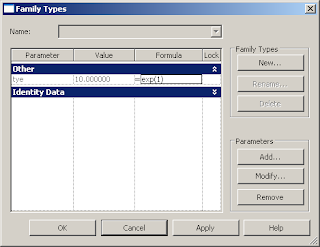
2.Formulas
The help states that exp(x) is e to the power of x. So exp(1) should be e (2.7182818...)
Hmmm.Or not.
3. Selection
This is a new one. It looks like the selection lines (you know, the square you get when selection stuff with your mouse) now have a variable line thickness. Looks strange to me...
4. Help
Online help only? OK, the help was never great in the first place. But why do away with a local version? Now I have to be online all the time to get to the help. (A bit difficult when working in the train...)
Labels: Bug, First Glance, R2011
Friday, April 23, 2010
As with Revit 2010, the guys at the factory realized that you will be using a few commands all the time. And if you don't like keyboard shortcuts, you want these commands quickly accessable - all the time.
Enter the Quick Access Bar. Here you can place any command-icon you want. Up until now, this was as far as it went. Sorting or dividing the icons was not possible.
This has changed. You can now edit to your hearts contend, simply by clicking the down arrow next to the last icon in you Quick Access Bar.
As I am using the bar quite a bit, I was vary happy to see this.
But what I really found interesting, is that most of the icons that are now displayed out of the box are the ones that I had installed in R2010. Funny that.
Labels: First Glance, GUI, R2011
Thursday, April 22, 2010
Well, Revit 2011 is now installed on my computer and I've been browsing thourgh it for a little while.
Here are a few things that I've noticed right off the bat, which I think are interesting. I'll make a few of these posts, each with a topic.
Today I'll start with the Ribbon:
Also, the modify-tab will stay open and in the same place whichever element you select.
Most notably: the selector for the family type has vanished from the Ribbon and is now housed with the element properties in an extra window. More on that later.
This new setup needs some adjusting, but is more consistent. I like that the modify-tab stays open, and even if I have already started a copy-command I can still change it to rotate. On the other hand to stack the icons in ones, twos or threes makes the Ribbon seem cluttered. So I'm still a bit on the fence on this.
Labels: First Glance, GUI, R2011, Ribbon
Friday, April 16, 2010
Well, it seems the April 8th-date was a bit premature for the 2011 release.
But it is finally happening and it looks like I'll be playing Revit 2011 over the weekend. :)
Expect more posts on R2011 in the near future.
Sunday, April 4, 2010
Here are the results for the latest installment of the Vote of the Week:
Seems like everyone is really looking foreward to this release. It should be a good step foreward.
Labels: R2011, Vote of the Week, VoW


